Color plays a pivotal role in interior design, influencing both the mood and functionality of spaces. Understanding color theory can transform how a room feels, making it warm, dynamic, or serene. For professionals who feel overwhelmed, this guide will help you move past the color wheel and harness the transformative power of color in interior design. This exploration provides you with a fresh perspective on how to create striking rooms while maintaining harmony and balance. Embark on a journey to master color combinations that express style, fulfill functions, and evoke desired emotions, allowing your spaces to inspire tranquility and productivity.
The Foundations of Color Theory
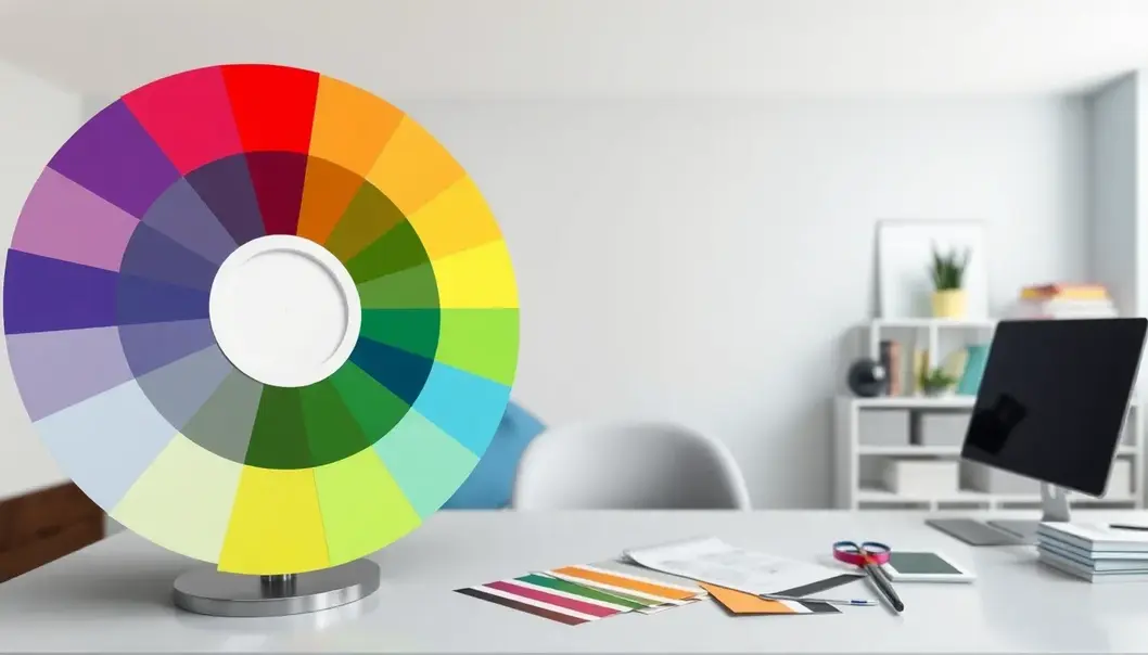
Color theory serves as the backbone of insightful interior design, establishing an environment that looks and feels balanced. At the heart of color theory is the color wheel, a tool that helps designers understand the relationships between colors. It features primary hues—red, blue, and yellow—that form the base from which other colors emanate. By combining these, we get the secondary colors and an intricate web of tertiary hues.
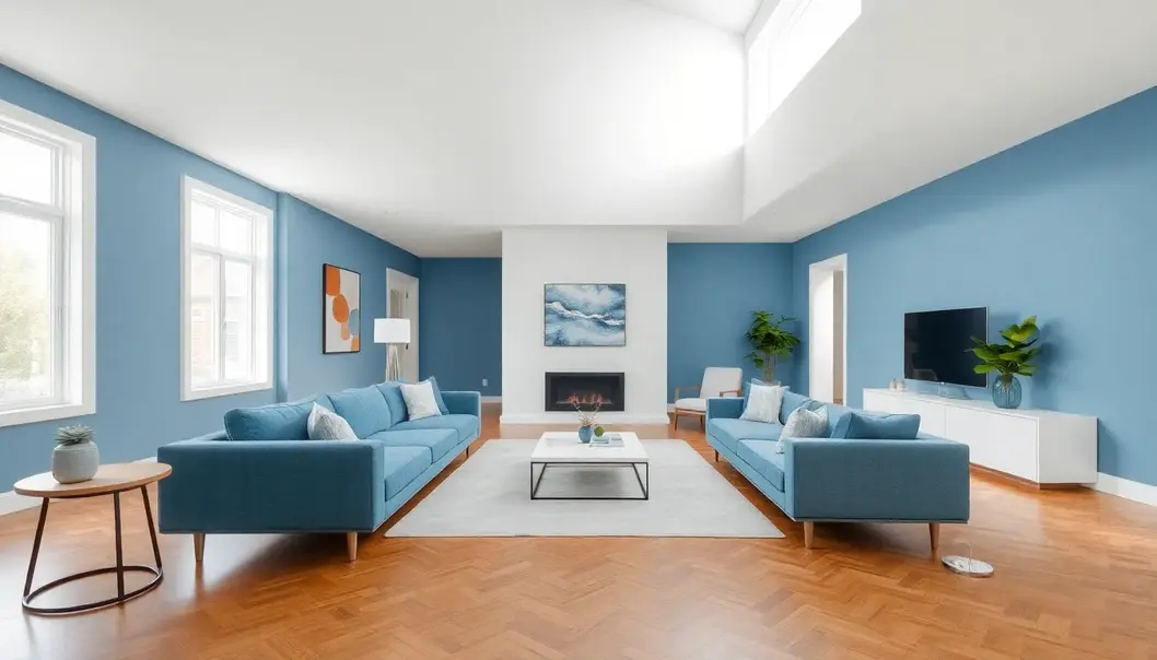
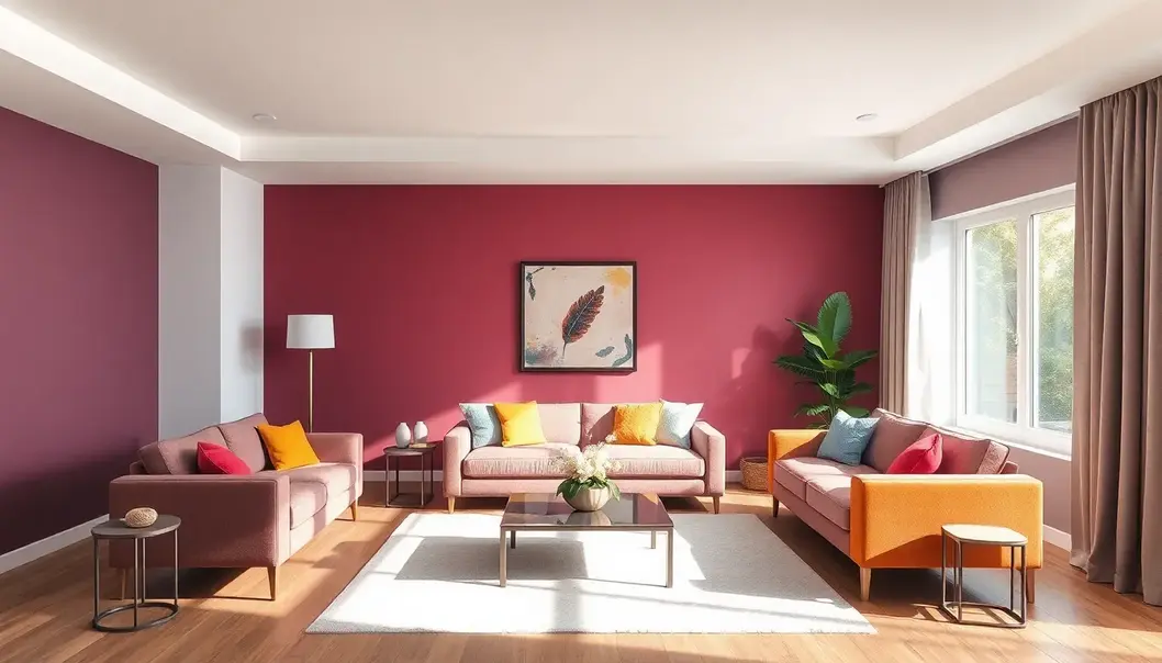
Understanding warm and cool colors elevates your ability to craft spaces that align with their intended purpose. Warm colors, like red and orange, are stimulating and can make a room feel inviting and lively. They are perfect for social spaces such as living rooms, where energy and excitement are desired. In contrast, cool colors, such as blue and green, evoke a sense of calm and tranquillity, ideal for bedrooms or meditation areas where relaxation is paramount.
Beyond individual hues, the magic of interior design lies in creating harmonious color schemes. Complementary schemes, which use colors opposite on the color wheel, create vibrant and energetic spaces. These are best used sparingly to avoid overwhelming the senses. A single feature wall or carefully chosen accessories can skillfully apply this principle. Analogous color schemes, which utilize colors next to each other on the wheel, produce a serene and comfortable design. They often appear in nature, becoming a safe choice to establish natural harmony, perfect for creating relaxing environments.
Triadic schemes, a balanced trio spread evenly around the color wheel, introduce equal contrast and vibrancy without overwhelming. This approach requires a careful balance of saturation and intensity to maintain harmony while keeping the space dynamic. Saturation, tints, and shades further refine mood, adjusting how a room’s color feels. High saturation colors exude vibrancy and boldness, while desaturated hues suggest subtlety and sophistication, suitable for workspaces where calm focus is essential.
Introducing tints, achieved by mixing a color with white, can brighten a space, enhancing feelings of openness and airiness. On the contrary, adding black to create shades lends depth and coziness, valuable for intimate settings. Thoughtful use of these elements tailors the mood to the room’s purpose, aligning its aesthetic and functional goals with its desired emotional ambiance.
Understanding the foundational elements of color theory is indispensable for any interior designer. As you develop your palette, consider how these principles can transform a room’s atmosphere, ensuring that every hue and shade contributes to a cohesive balance.
Practical Application of Color in Interiors
Utilizing color harmony effectively in interior spaces can transform a room not only aesthetically but also functionally. Consider a client seeking a serene atmosphere in their living room—a place of respite from the hustle and bustle of life. Here, professionals might opt for a dominant cool hue, such as a soft blue, known for its calming qualities. Accent colors like muted greens or light grays can complement this choice, creating a cohesive and tranquil setting.
In one case study, a boutique hotel sought to enhance its lobby’s functionality and emotional impact. They aimed to foster a welcoming, luxurious ambiance while accommodating the practical needs of guests. The designers selected a rich, deep green as the dominant color—symbolizing opulence and relaxation. They paired it with gold accents, adding warmth and a touch of sophistication. This strategic use of color not only amplified the room’s aesthetic appeal but also improved its functional engagement with guests. By carefully choosing these color dynamics, the hotel transformed its lobby into an inviting sanctuary that encouraged guests to linger and engage.
Lighting plays a crucial role in the perception of color, often altering hues throughout the day. It’s essential for designers to test paint swatches in varying lights, from morning brightness to evening dimness, ensuring the final outcome aligns with the envisioned ambiance. Natural light can bring out the blue undertones of a warmer color, altering its appearance dramatically. Conversely, artificial lighting might cause colors to appear warmer.
By acknowledging these variations, designers can tailor spaces to maintain their intended vibe across different lighting conditions. This meticulous attention to lighting can further enhance the room’s identity, making it not only inviting but also functional under all lighting circumstances.
Through the practical application of color theory, a room’s identity becomes a tapestry of interconnected elements that evoke specific emotions and functionalities. Professionals harness their expertise in color harmony to shape interiors into environments that resonate with their intended purpose, be it relaxation, productivity, or creativity. This nuanced approach underscores the transformative power of color, deepening the emotional and functional resonance of living spaces.
Final words
Understanding and applying color theory in interior design can alleviate the overwhelm and deliver harmonious, purposeful spaces. With a grounded knowledge of how color influences mood and function, professionals can wield this tool to tailor environments that meet aesthetic goals while supporting intended uses. Embrace the art of color to creatively define spaces, ensuring they are both productive and calming.
Elevate your design skills by enrolling in our comprehensive course on color theory application today!
Learn more: https://www.designacademy.com/color-theory-course
About us
Design Academy offers a full spectrum of interior design courses, specializing in color theory, allowing professionals to refine their skills and discover innovative ways to elevate their projects. With expert instructors and practical modules, you’ll gain confidence in creating spaces that are both beautiful and functional.